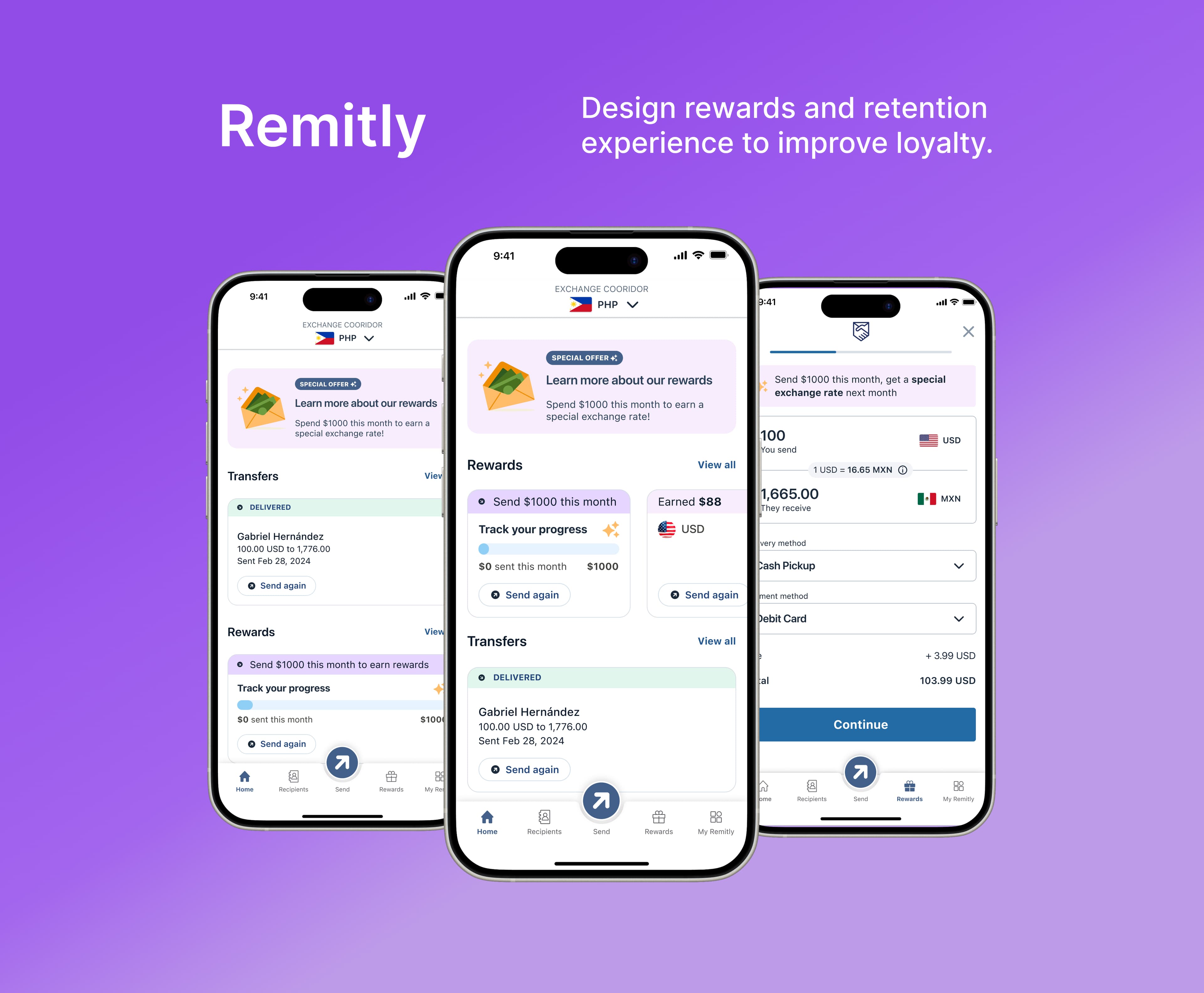
Growth is in high demand at Remitly
Designed rewards and retention experiences that make the product stickier and drive long-term growth by building future value into everyday engagement.
As a Product Designer on the Growth team, I partnered with PMs, data analysts, and engineers to take retention-focused experiences from concept to launch.
Duration
Nov 2024 - Jan 2025
Team
Product Designer
Product Manager
Engineers
My Role
UX Design, Visual Design, Research, Design system, Usability Testing, Cross-functional Facilitation, Stakeholder Interviews
Rewards Project Impact
The launch significantly lifted customer engagement and conversion, directly driving $29M in revenue.
↑ 78%
Customer engagement grew 78% across invitation and earned modals, the rewards card, and calculator banner views
↑ 65%
39,000 customers joined the A/B test, and 65% qualified for rewards across multiple corridors
↑ $29M
27,283 customers sent over $1,000 in their first month after launch and qualified for rewards
Problems
Over 60% of users don't return after their first transaction, often switching to competitors for later transfers.
Engagement fell 60% in the three months after a user's first transfer. Without a meaningful reason to come back, Remitly had become a one-time tool instead of a trusted habit.
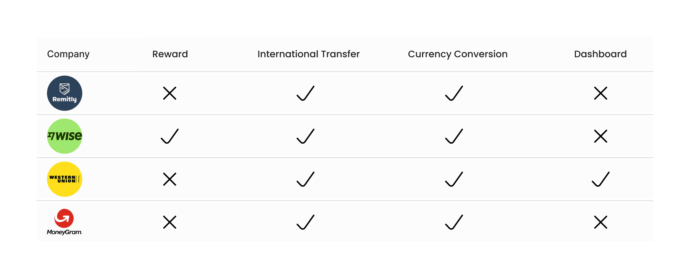
Competitor Analysis
Competitors with loyalty programs retain 20% more users. Little engagement after a transaction leads to high churn.
Synthesize Insights
User research into the problem led us to 3 key insights:
- Customers making planned, non-urgent transfers care more about price than speed or delivery options.
- Customers focus on their current transfer, not the special offer — even when curious, they need frequent reminders.
- Although the special offer applies next month, the feeling of achievement happens in the month they qualify.
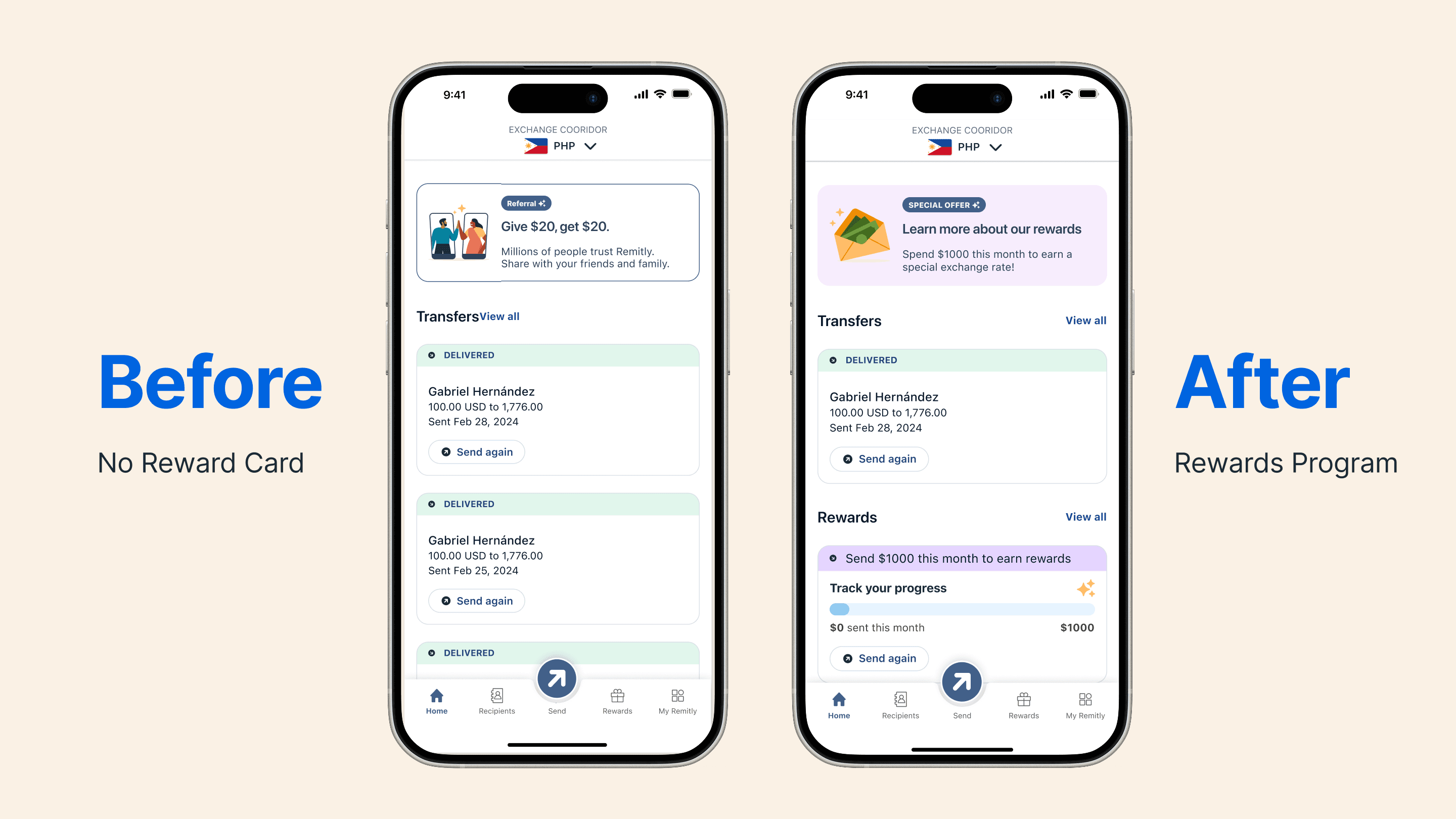
Final Design
Guided by these insights, we ran a design sprint exploring concepts from subtle prompts to more prominent interventions.
It uncovered major untapped potential in designing for trust on Remitly's platform.
User Flow
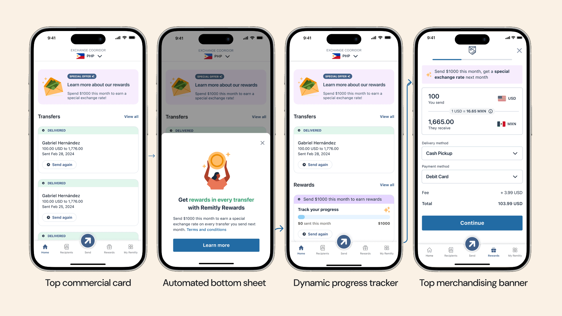
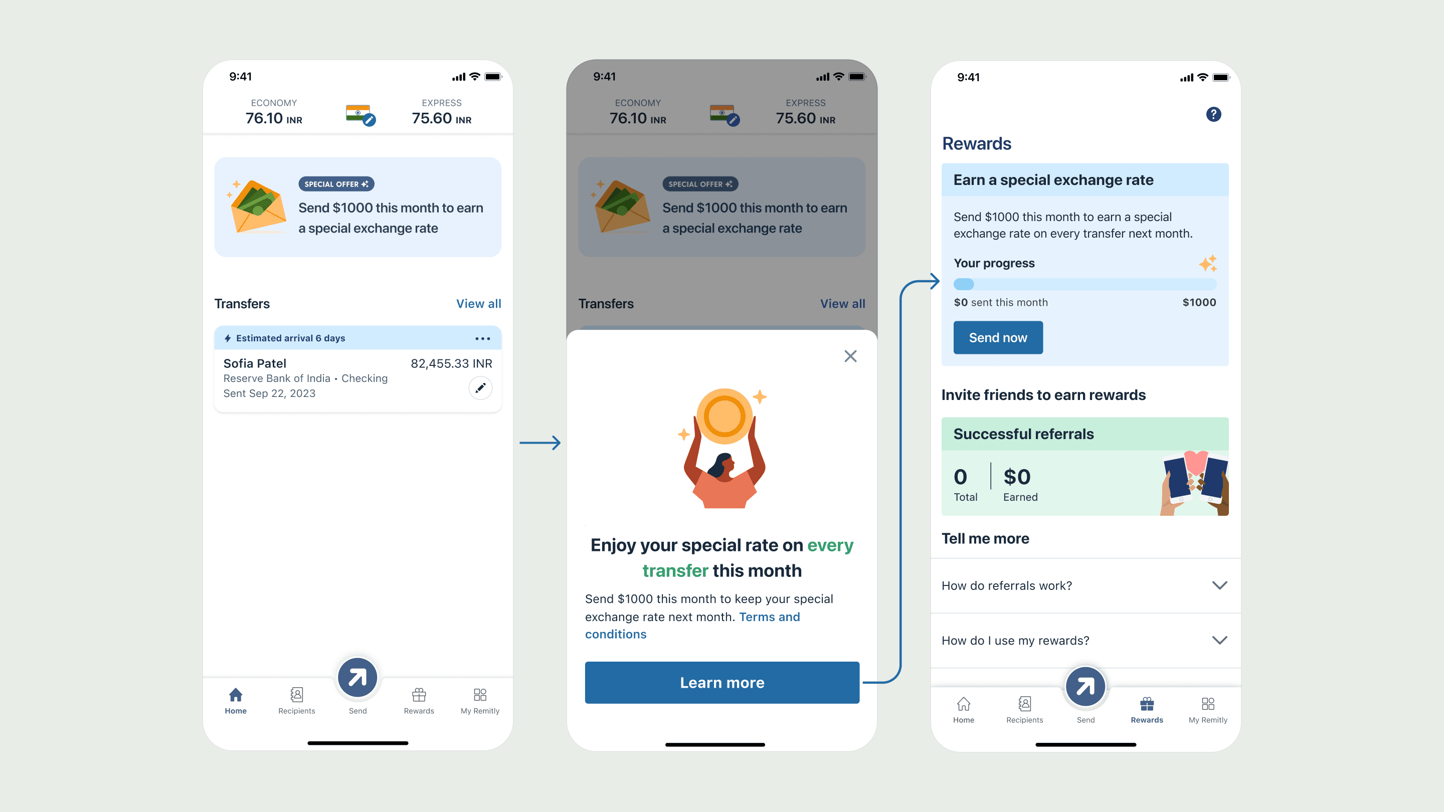
Home Banner → Drawer Pop-Up / Rewards Sign-Up → Rewards Widgets & Send Again → Enter Send Flow
- A social card on the home screen, with a drawer that pops up automatically.
- A progress bar that keeps tracking how much customers have sent.
- A special exchange rate banner in the send flow that keeps customers reminded.
Design Components Contribution
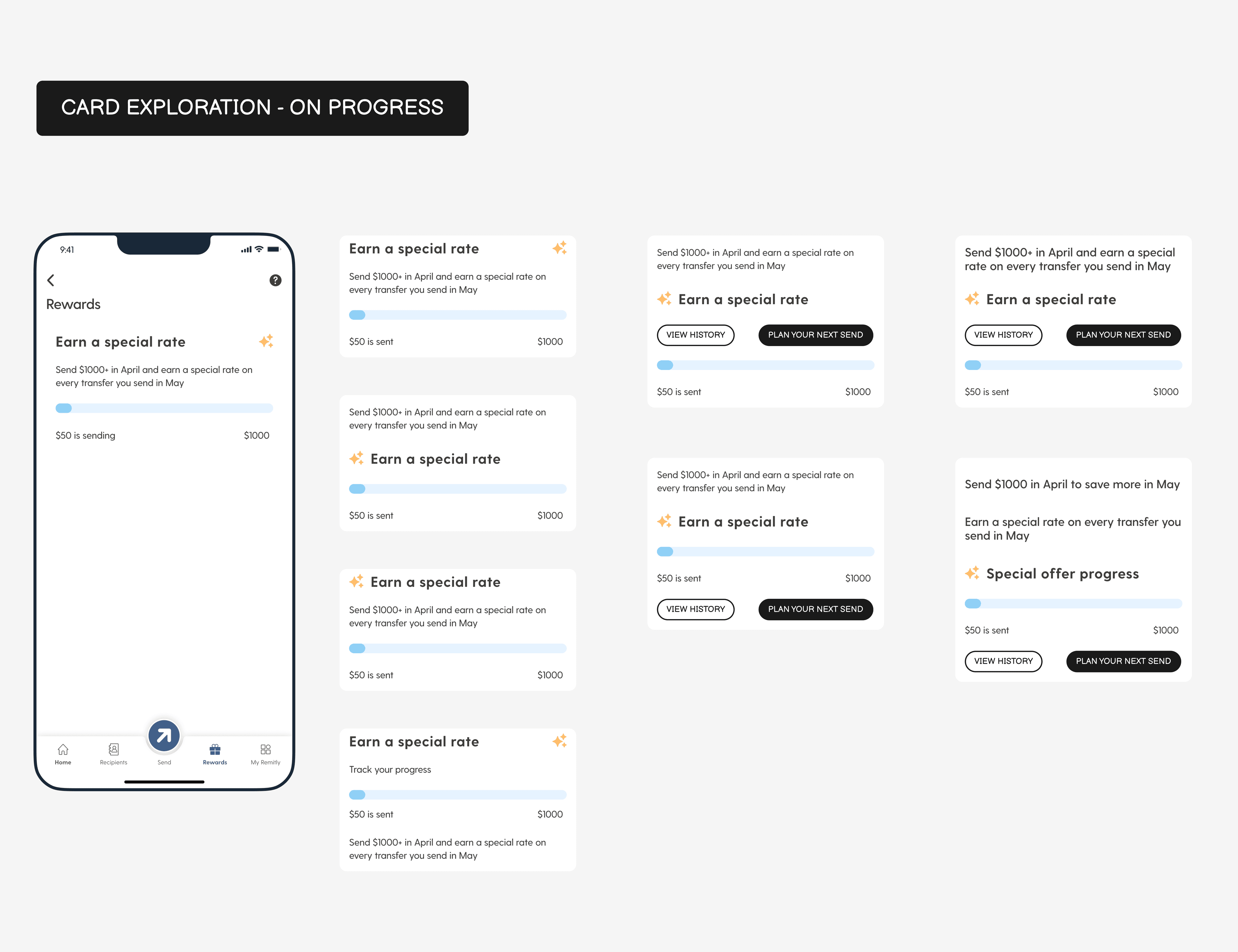
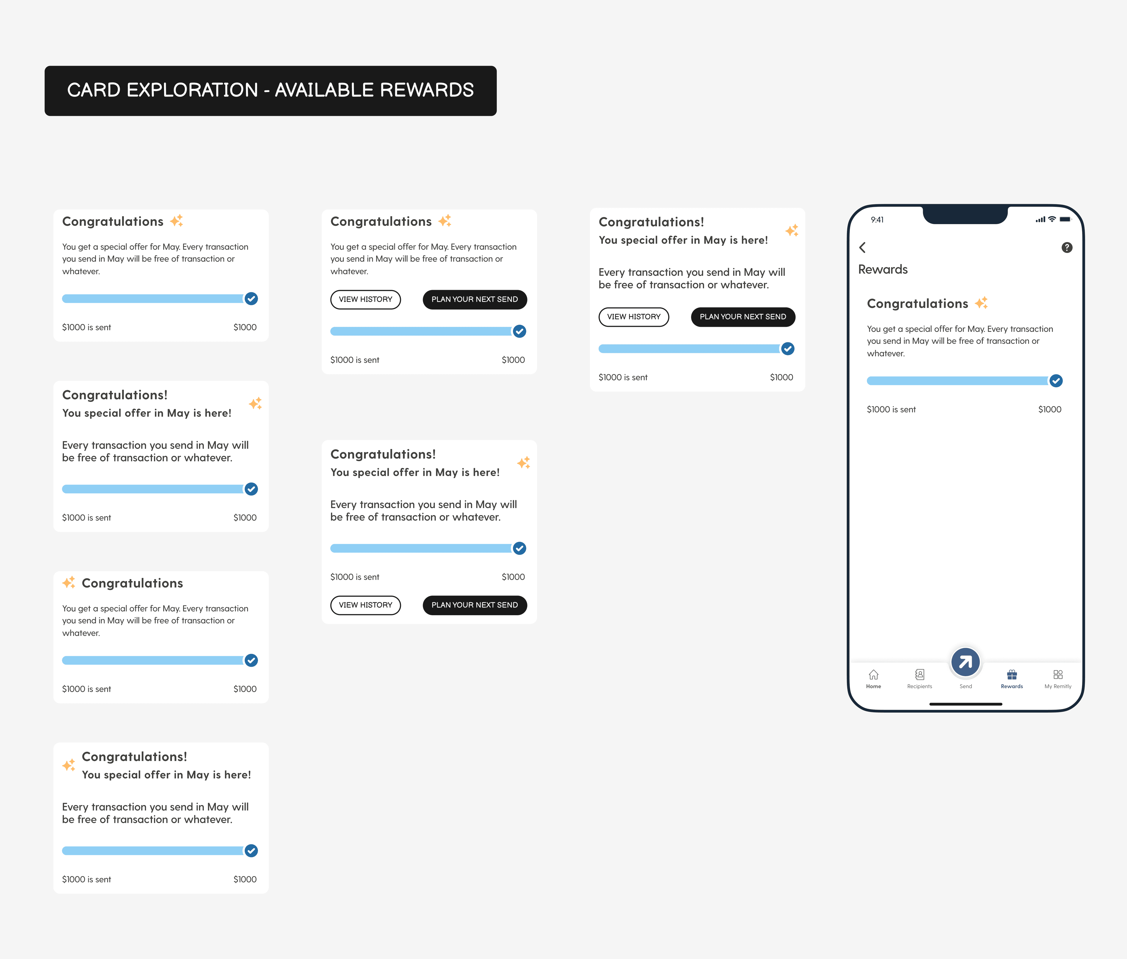
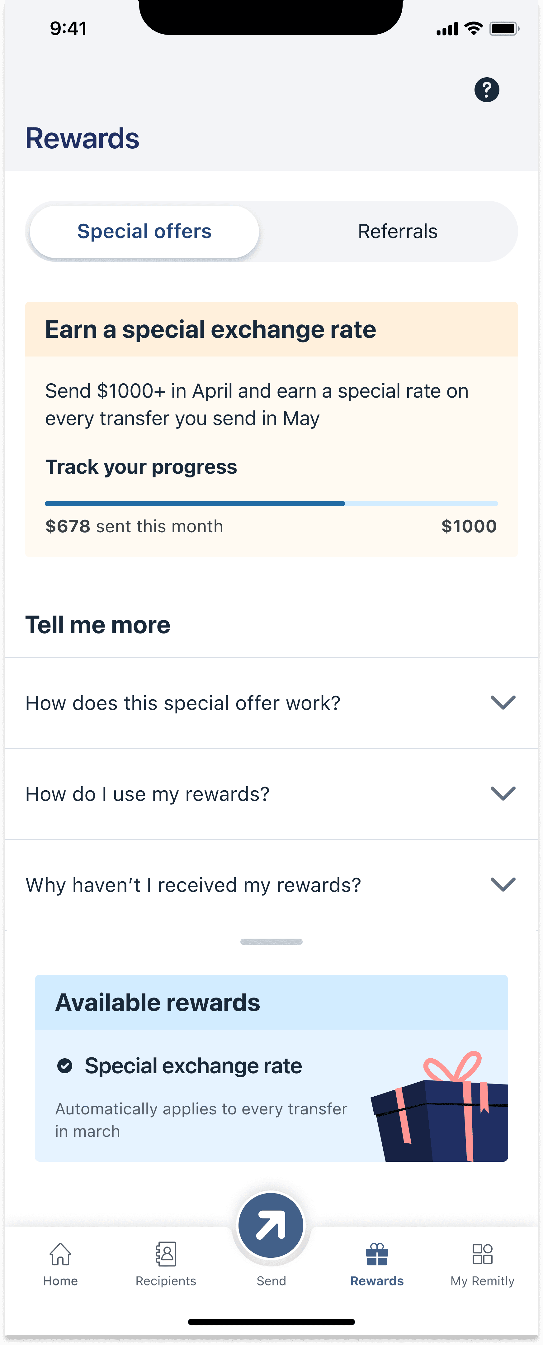
Progress Cards Exploration 1
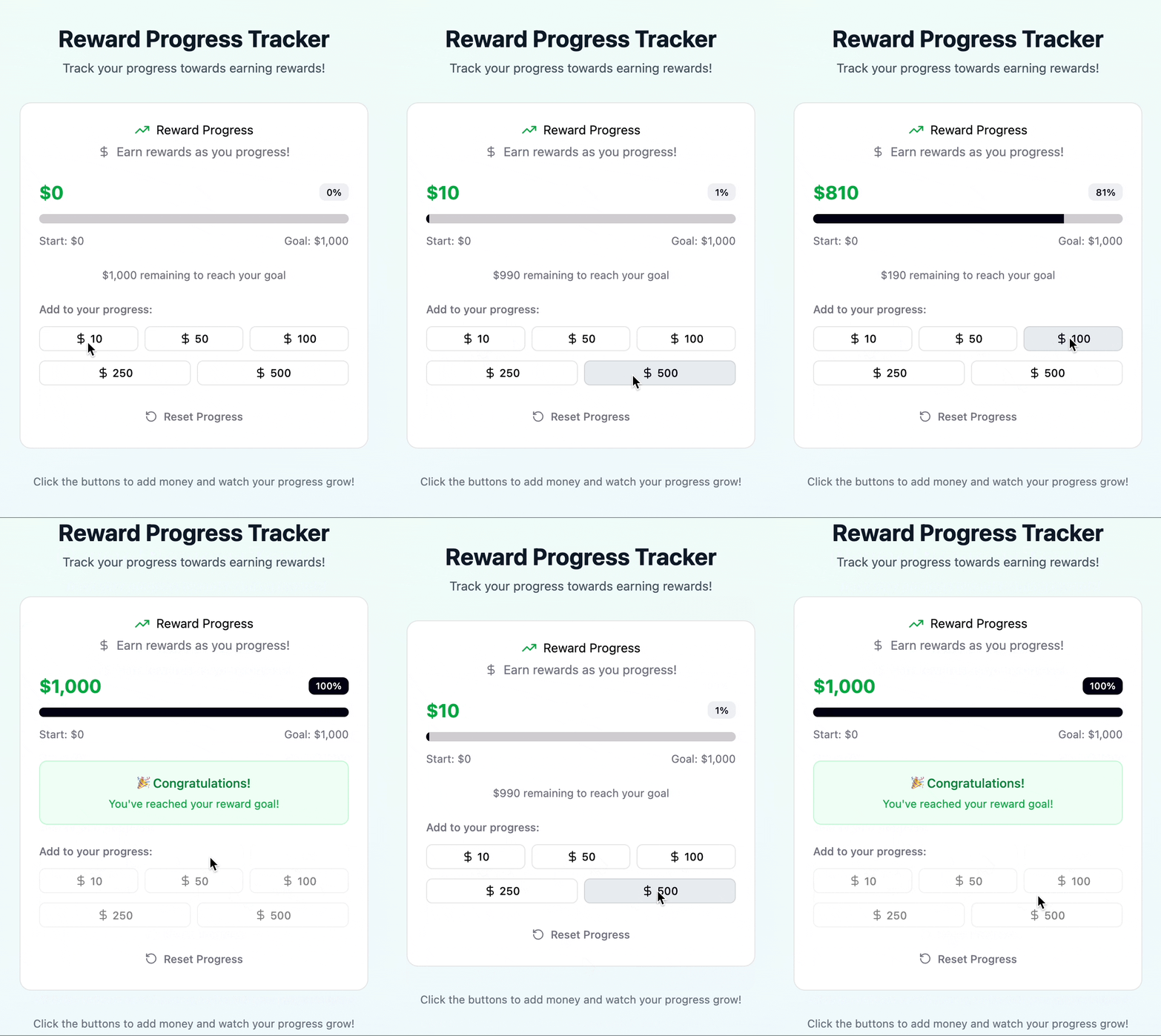
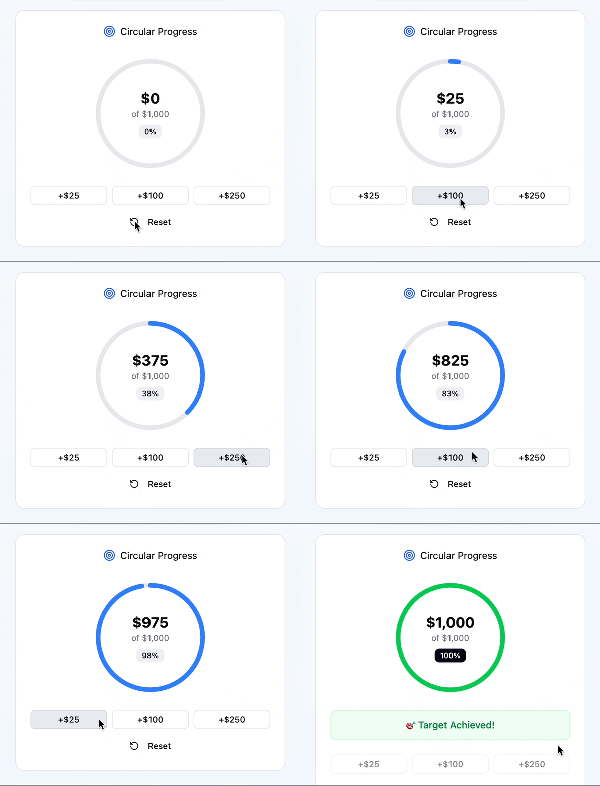
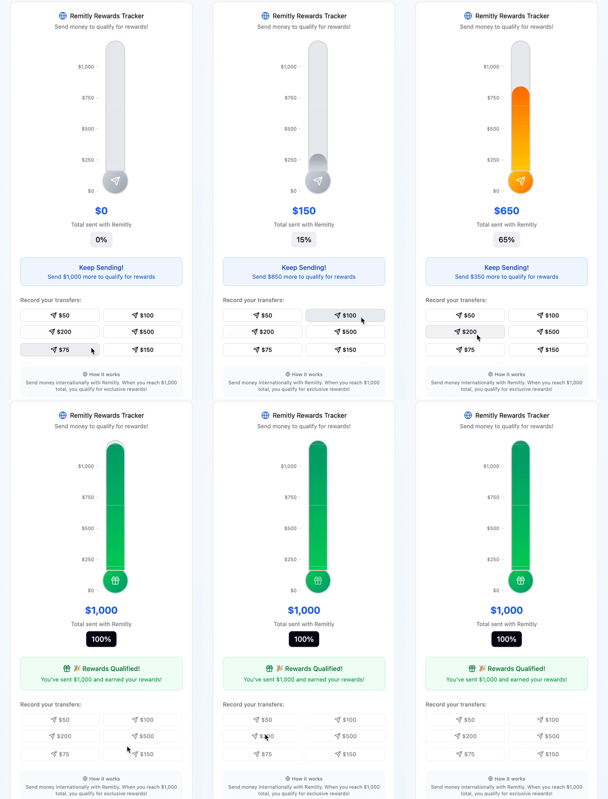
The progress card helps customers track how much they've sent with Remitly, see how close they are to earning rewards, and celebrate their progress along the way.
Design Components with Design System Team
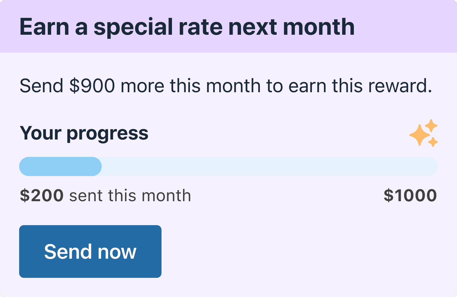
Progress Cards Exploration 2
I partnered with the Design Systems team to introduce a new, scalable tracking bar component and helped build it.
Pros
- Customers can easily see their send amount in the loyalty program.
- Aligns with the design system.
- Customers can view their progress at a glance and quickly send again to make more.
Rewards Tracker Final Version
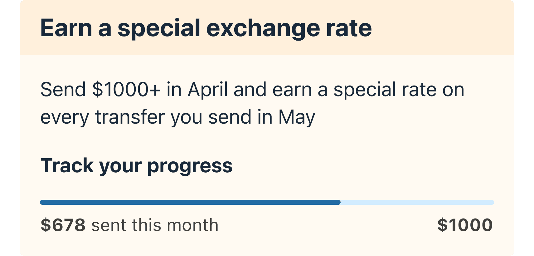
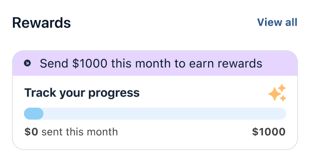
Progress Cards Final Version
Introducing a new component and making it scalable across all platforms.
Pros
- Aligns with home design patterns.
- Saves engineering effort and helped us hit the launch deadline.
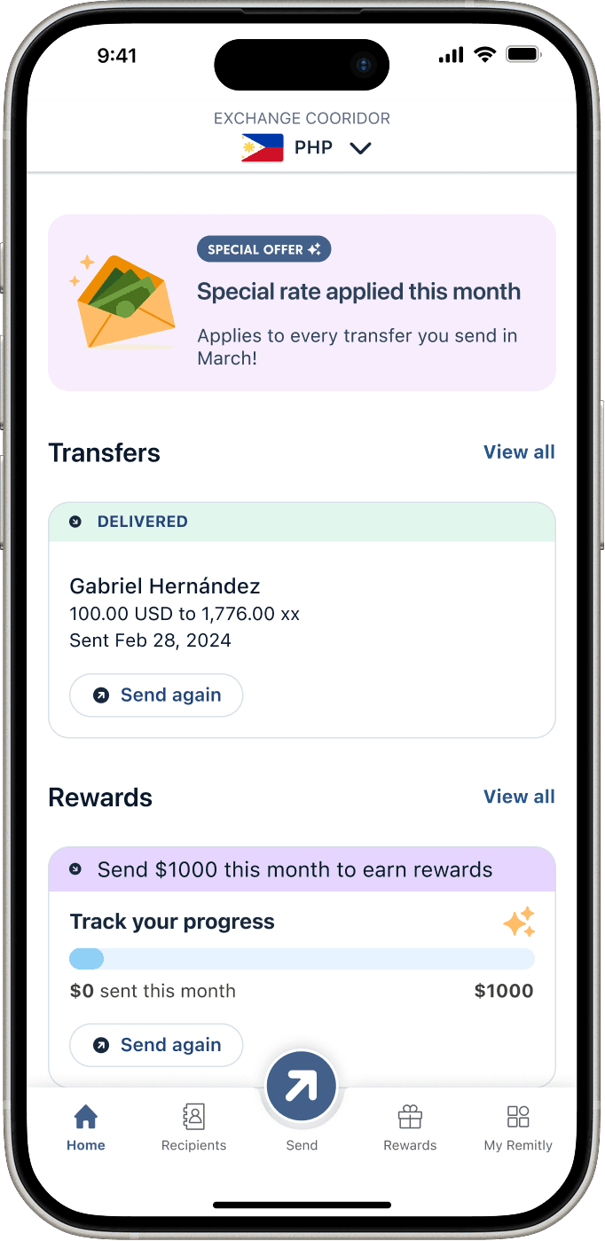
Final Design
- Surfaces rewards progress on Home to boost engagement and catch customers' attention.
- Saves space for transfer history.
Commercial Banner & Exchange Rate Design Explorations
Communicating at the right moments
I explored how to surface reward reminders at different points in the send flow, aiming for timely, context-aware messages that don't add cognitive load.
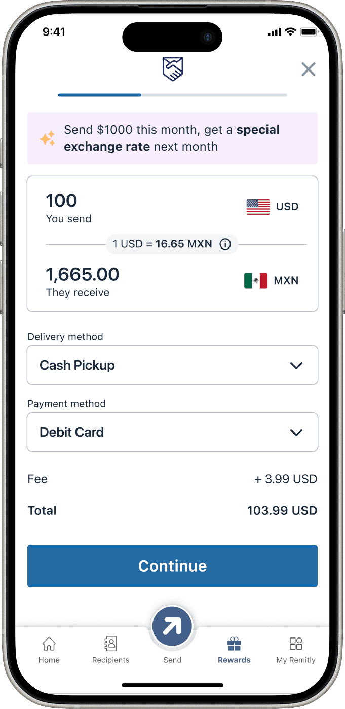
A key solution was a commercial banner on the calculator page confirming that rewards were being tracked. I tested several page hierarchies and banner placements so the message felt helpful, not intrusive.
Building confidence — exchange rate component design
I also explored several exchange rate designs to help customers feel comfortable and confident while sending money, focusing on clarity, transparency, and less uncertainty.
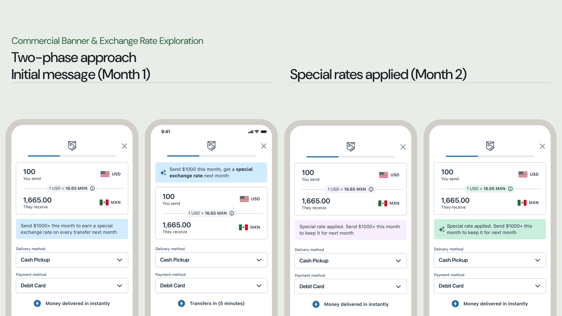
Final Version of Commercial Banner & Exchange Rate
Impact on Design System
Changes
- Update hierarchy: Aligned the merchandising banner in the send flow with the Home offer.
- Exchange rate component: Moved it to grey for a calmer, more neutral interaction.
- Ensure consistency: Added an icon and refined colors to match the commercial card offer.
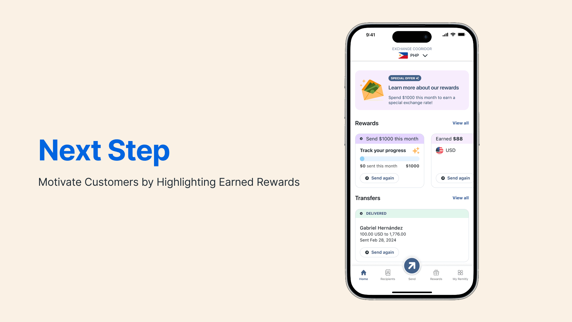
Next Steps
Keep motivating customers to earn more rewards