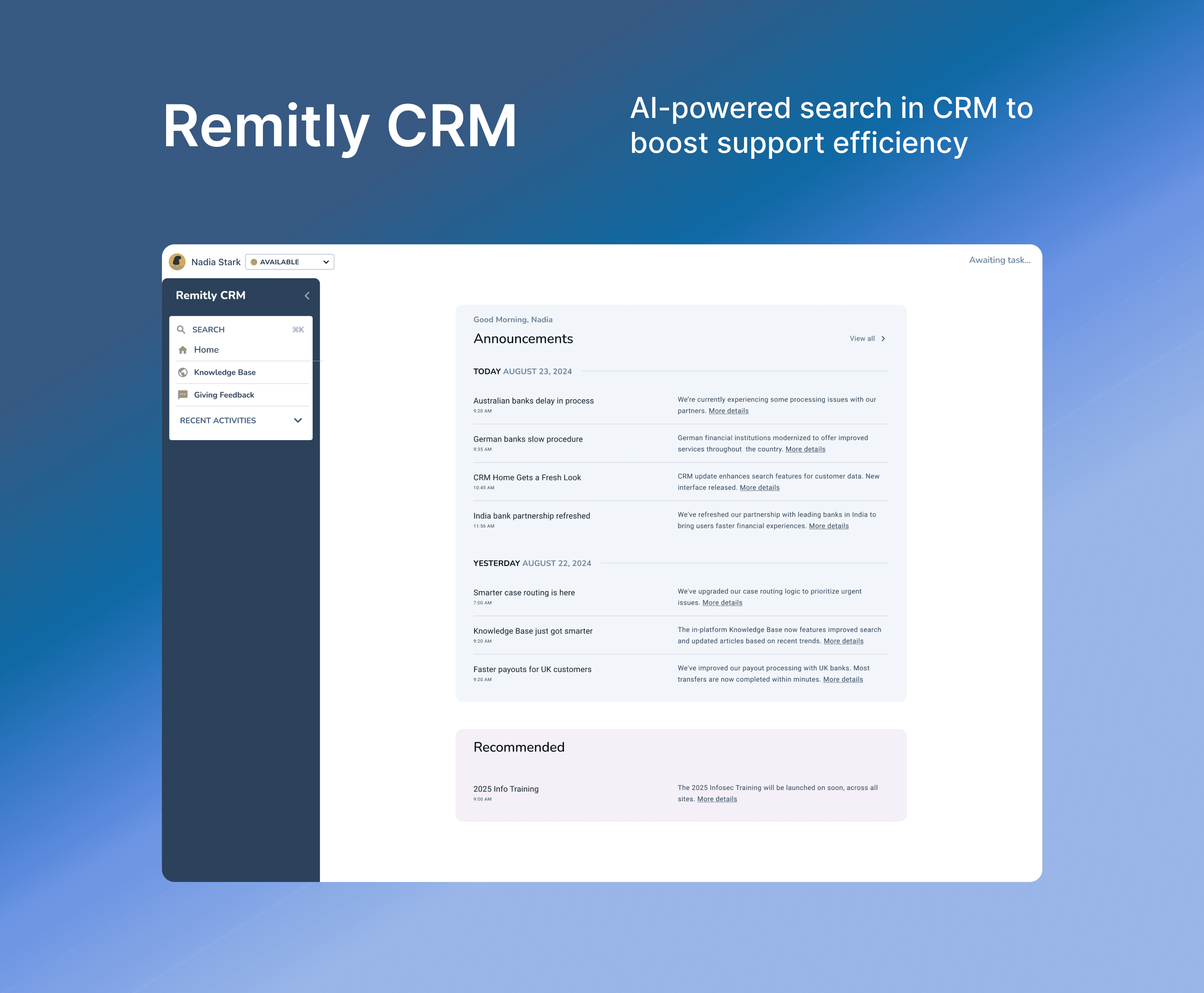
Driving $9M in annual cost savings
Designed the CRM Home and Global Search experience to streamline agent workflows, save time, and get agents to the right customer data and tools faster.
As Lead Product Designer on the CS team, I partnered with PMs, engineers, and CS stakeholders to design scalable, personalized tools for customer success agents around the world.
Duration
Nov 2024 - Jan 2025
Team
Product Designer
Product Manager
Engineers
My Role
UX Design, Visual Design, Research, Design system, Usability Testing, Cross-functional Facilitation, Stakeholder Interviews
CRM Home & Search Project Impact
Scalable, AI-powered search improved agent engagement, speed, and confidence — laying the foundation for a more efficient global support operation on Home.
↓ 30%
Cut agents' search time by more than 30%
↑ 3000+
Gave internal teams more accurate, owned content and set a new design standard used by 3,000+ agents worldwide
↑ $9M
Added $9M in company value with the new tools and raised confidence scores in agent NPS surveys
Problems
A fragmented CRM with no Home and broken search made it hard for agents to stay engaged.
Agents struggled to find up-to-date customer information quickly. Internal audits found that over 40% of case resolution time went to searching across disconnected tools and systems.
Current State
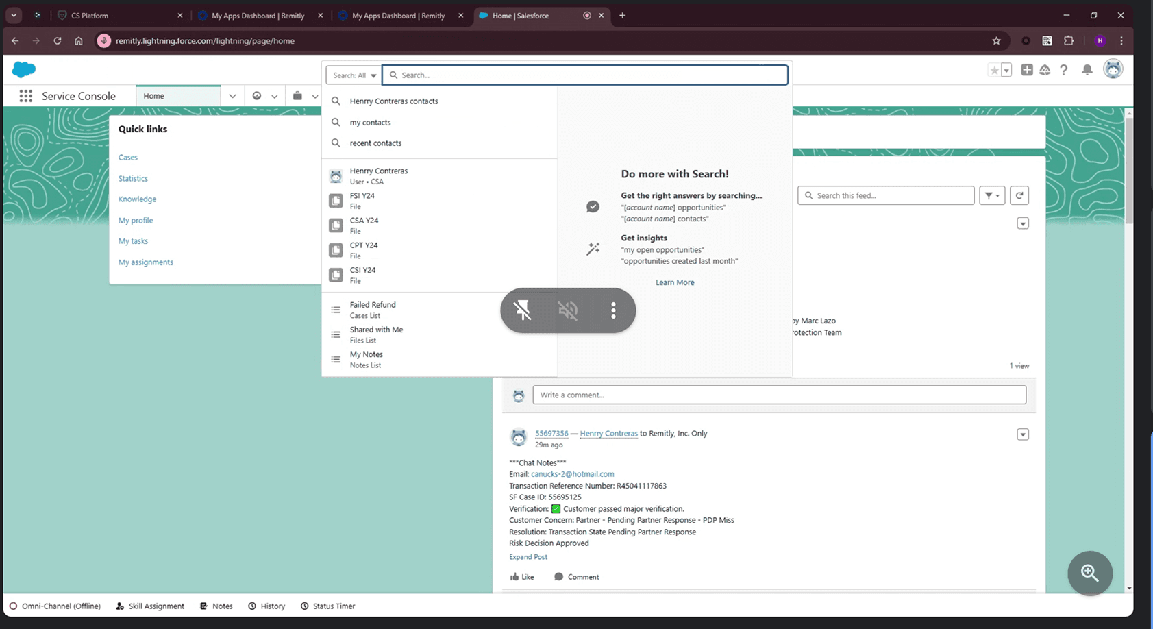
Agents spend most of their time in Salesforce, as shown below.
Competitor Analysis
Competitive analysis shows that successful CRM platforms consistently balance three critical elements:

Synthesize Insights
I led the research — interviewing 15 agents, observing workflows, and running focus groups across three continents — and uncovered key patterns:
Key patterns
- Inefficient navigation: Agents lost time switching between tools to piece together customer context, which slowed resolution.
- Inconsistent search results: Search was unpredictable and often returned irrelevant or outdated results.
- Lack of prioritization: There was no clear, actionable place to start after logging in, leading to confusion and backlog.
- Information overload: Too much low-priority data made it hard to focus on what mattered most.
Design Strategy
I aligned with the PM and engineer and split the work into two core areas: Home and Search. They share a foundation of common patterns but solve distinct problems.
CRM Home Design Principles
- Action-oriented: surface tasks and recent cases at a glance.
- Modular: let sections change as workflows evolve.
- Regionalized: make region-specific tasks easy to reach.
Global Search Design Principles
- Fast and forgiving.
- Relevant across personas and products.
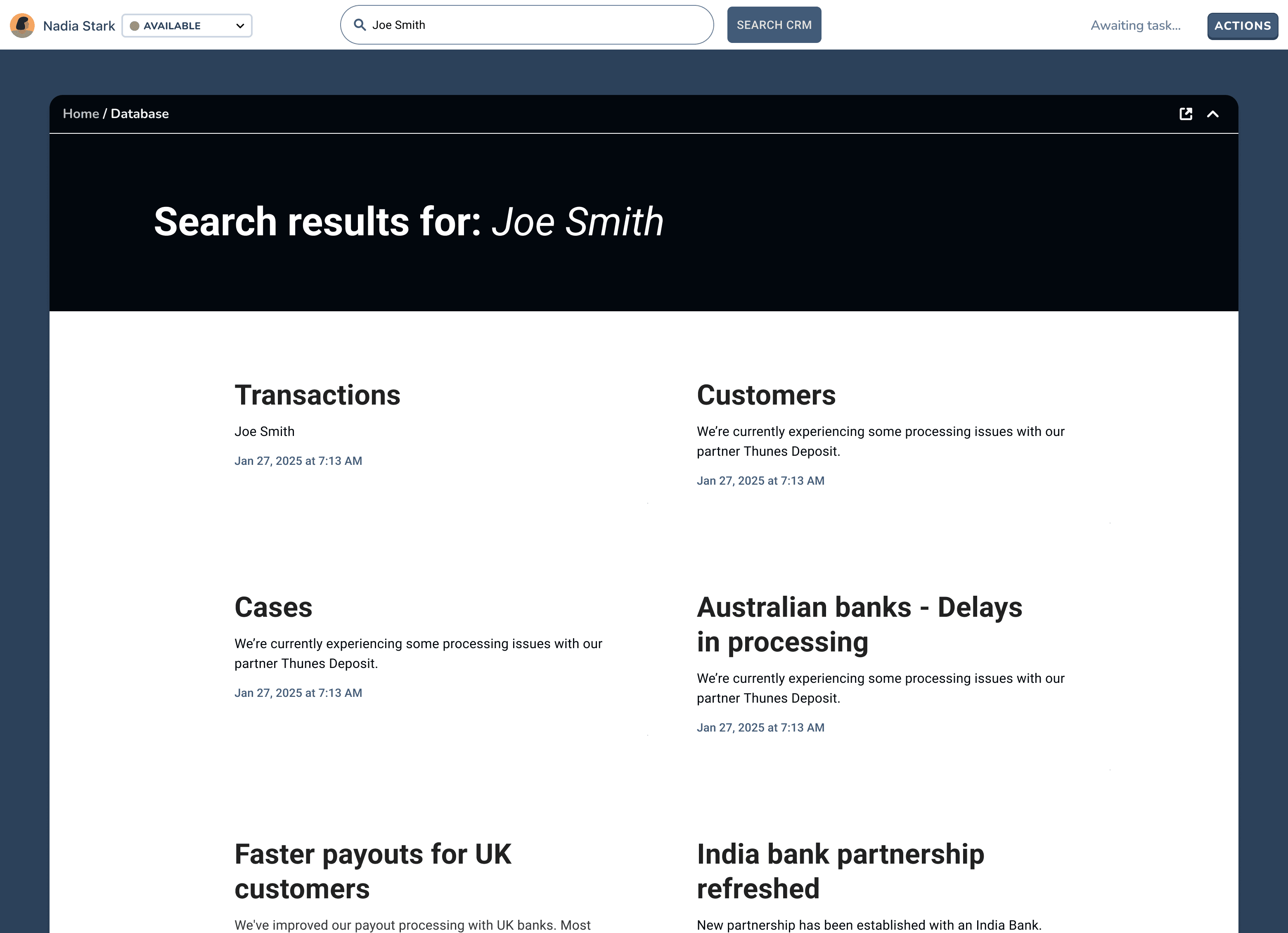
- Intuitive grouping of results by type (user, case, KB, transactions).
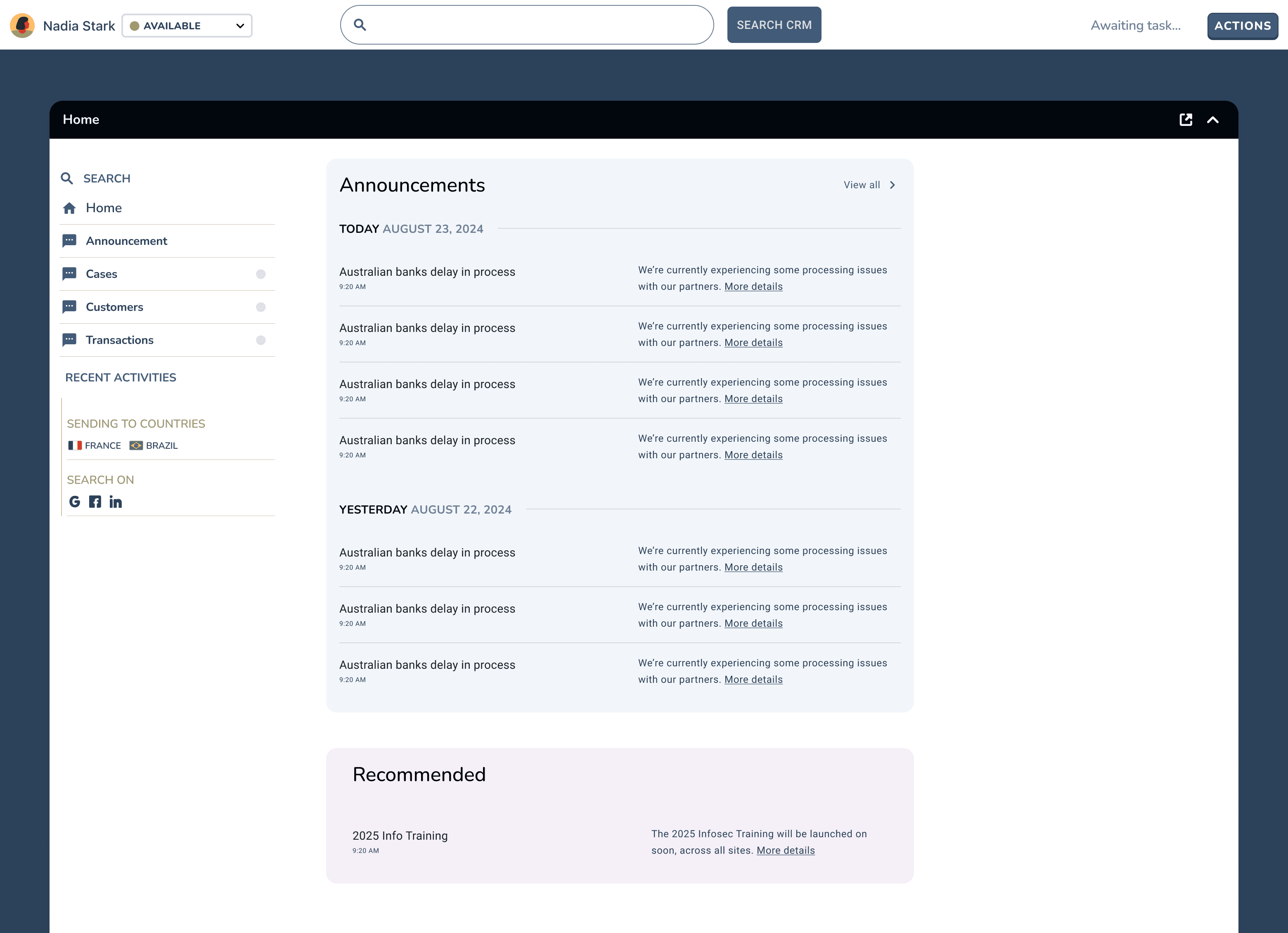
Design Explored 1 - Mid Fidelity Home Layout
Announcements: a must-read section that keeps agents informed with daily updates.
Search: used multiple times per call and critical for fast, accurate resolution.
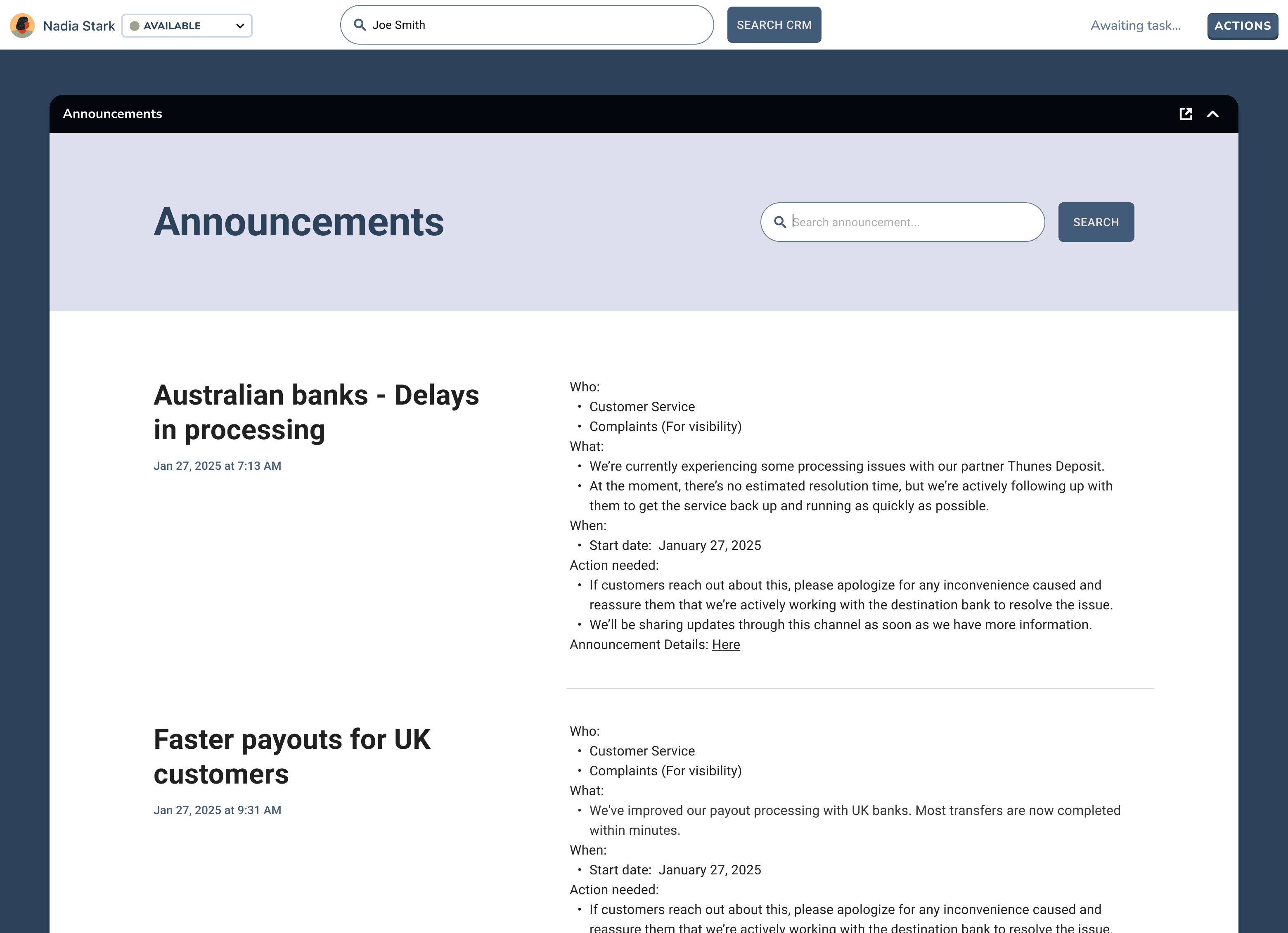
Design Explored 2 - Mid Fidelity Home Layout
Dedicated pages for announcements and search
Announcements
Search
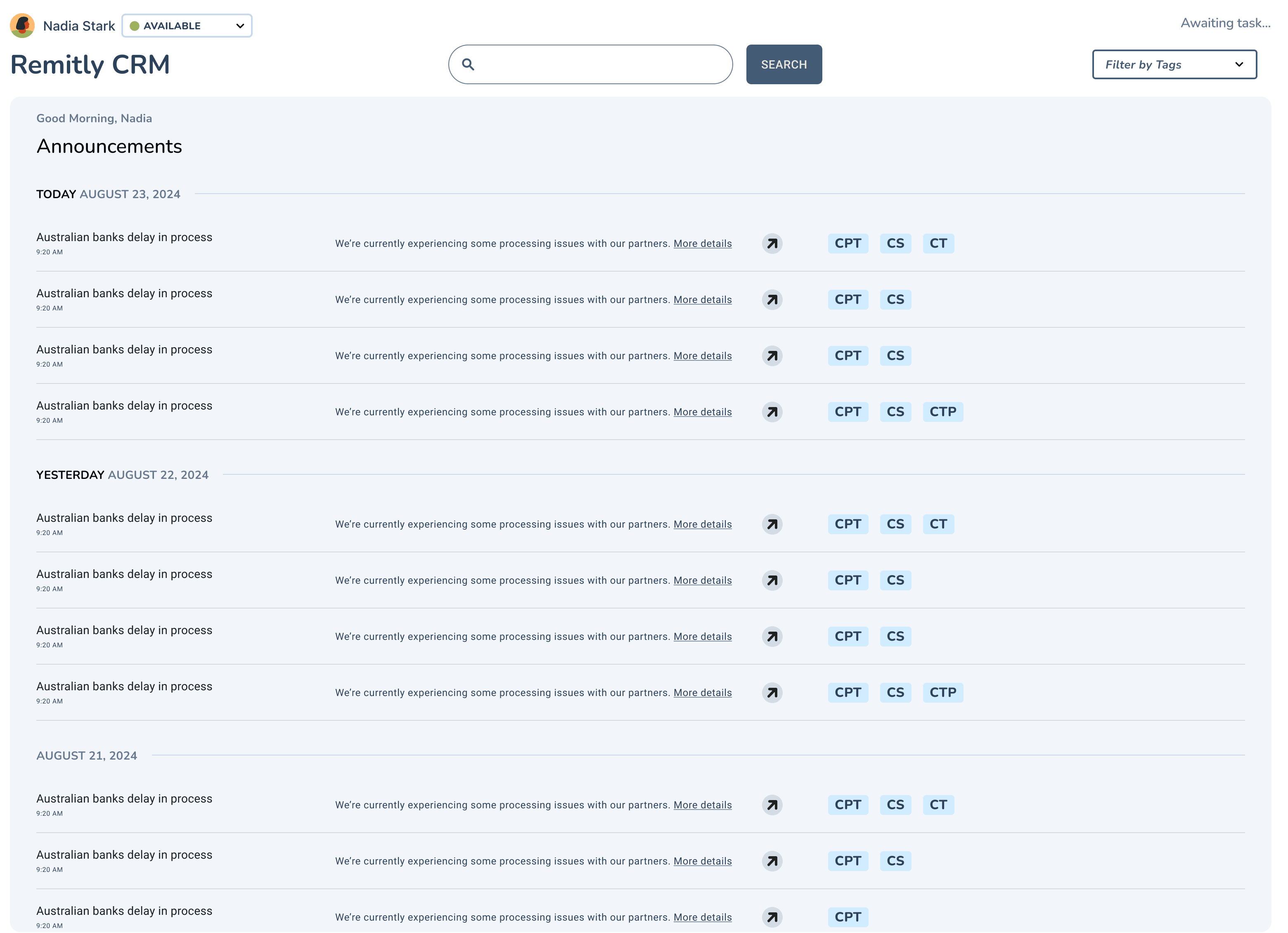
Design Explored 3 - Mid Fidelity Home Layout
Announcements filtered by tags
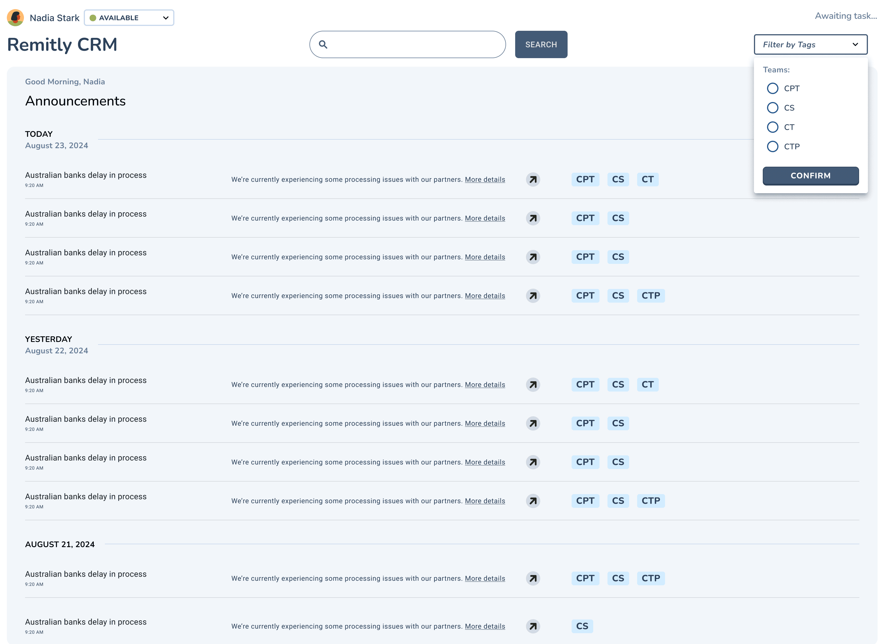
Move on with the 3rd exploration
Aligning on what to ship first
Decision
- Tech constraints: Showing different categories wasn't possible on our tight timeline.
- Align priorities with PM: Solve the most important surfaces first — announcements and search.
Detail oriented - Visual explorations of Announcements Dates
“Today” and “Yesterday” labels, followed by infinite scroll for older updates, make the feed clearer and easier to read each day.
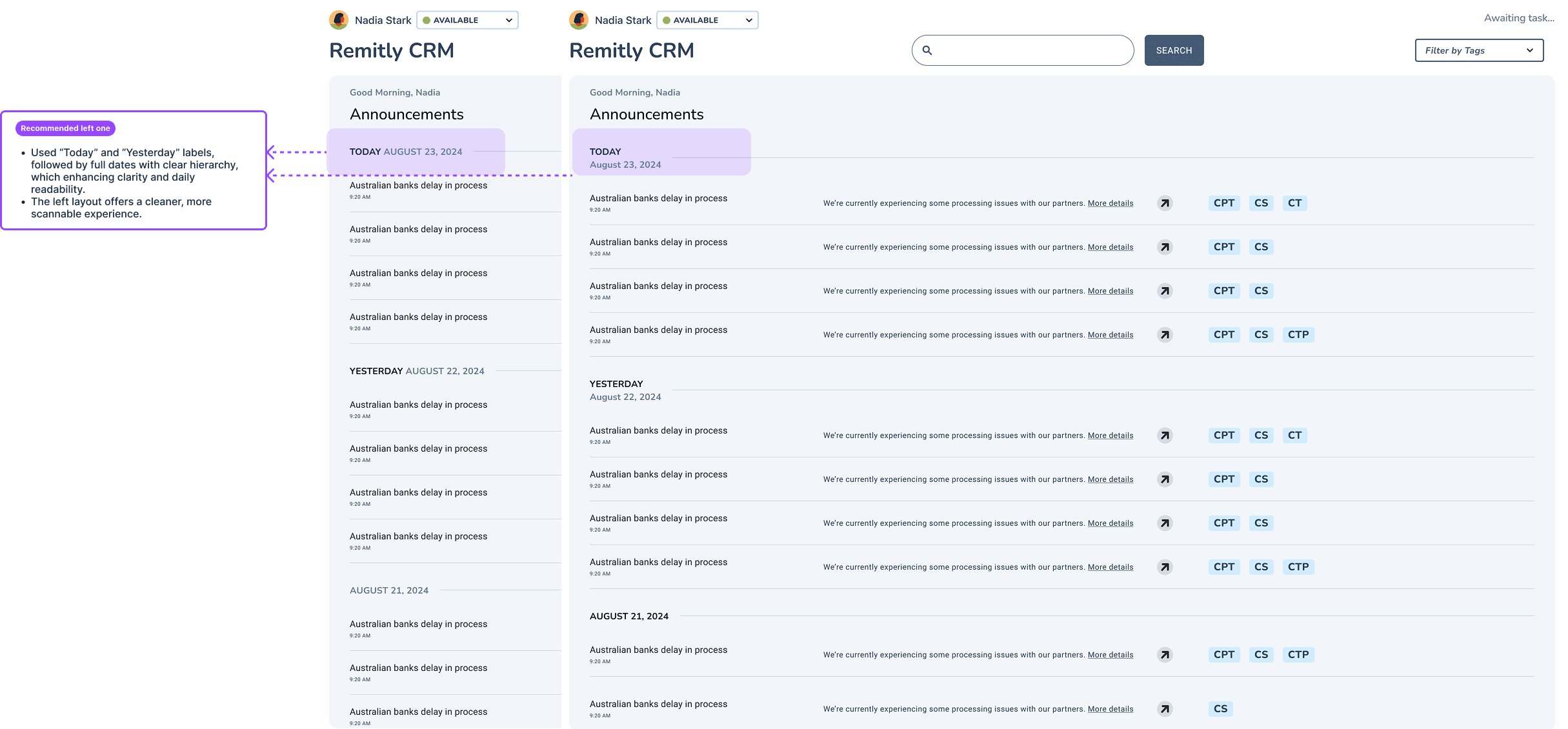
Chosen direction
- ✅Relative date labels with full dates below for clear hierarchy.
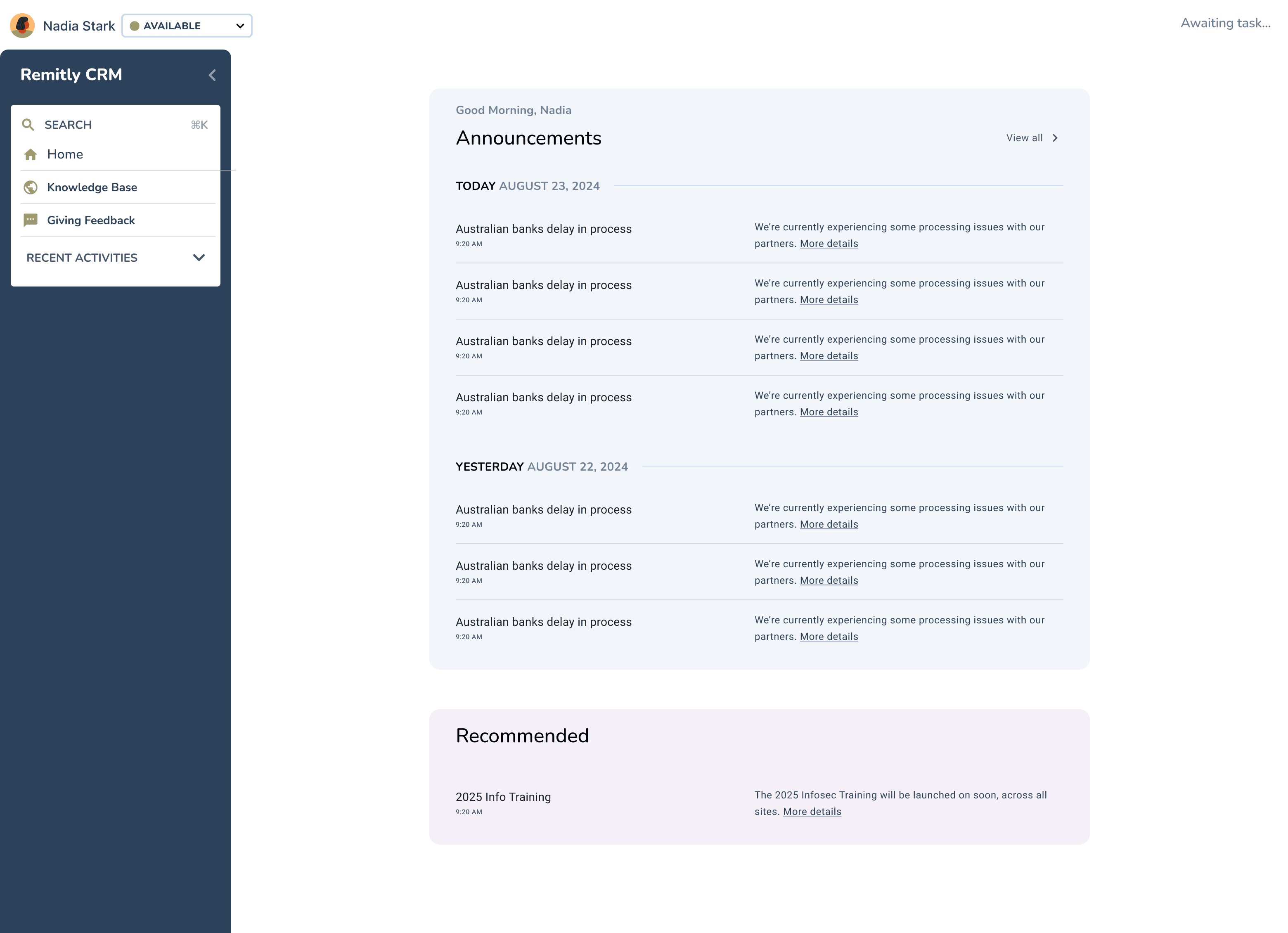
Usability Testing validated my assumption: a side nav bar helps agents navigate quickly
The sidebar option earned the highest satisfaction score from users.
Iteration
- ✅Clear hierarchy, with search quickly accessible from the nav bar.
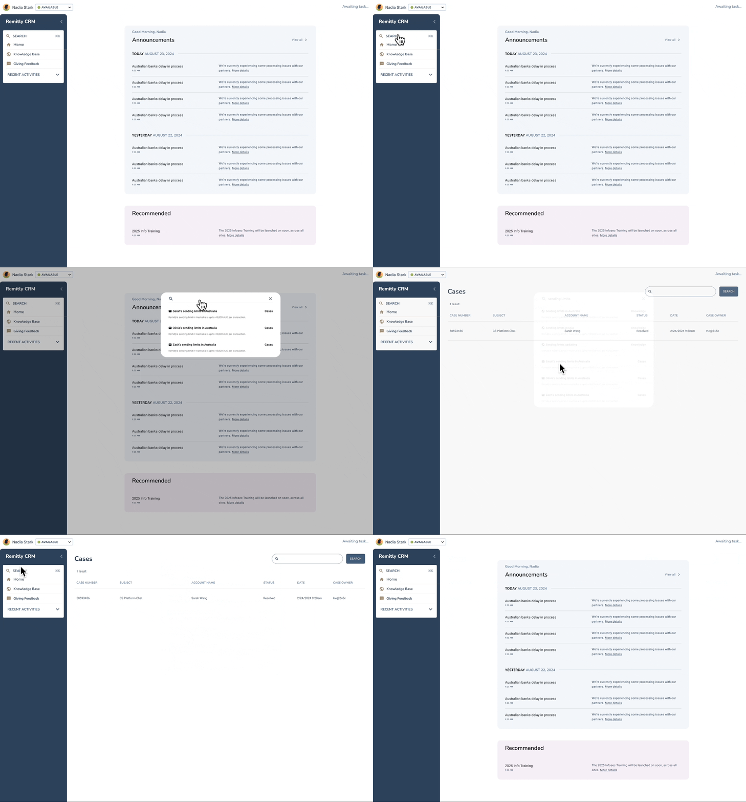
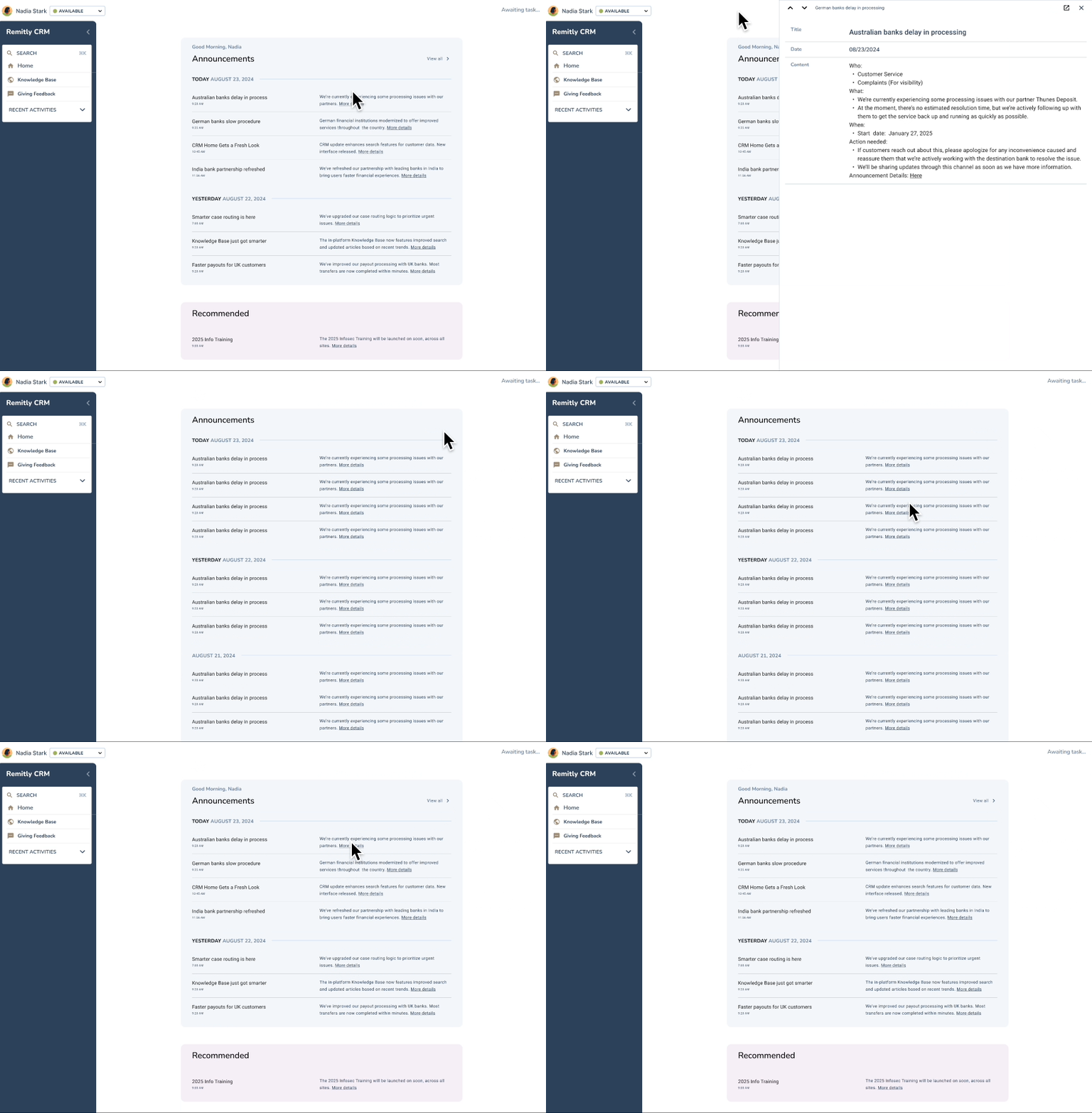
Final Design
Building on these insights, I rapidly prototyped and tested design directions focused on search relevance, task visibility, and interface clarity. Usability testing confirmed the sidebar for quick navigation.
Home
- ✅Sidebar gives quick access to essential workflows like search.
- ✅Announcements are a key daily touchpoint for critical updates.
Announcements
- ✅Slide-in panel shows details without opening new tabs, reducing context switching.
- ✅Infinite scroll keeps older announcements easy to reach for reference.
Learnings
What I'd take to the next project
Use usability testing to validate assumptions.
When there are several directions and competing stakeholder opinions, testing shows what actually works best for users.
Hold regular meetings with key stakeholders.
When moving fast, a regular cadence keeps the feedback loop tight and everyone aligned.
Be willing to take risks when clarity is limited.
Bold ideas often lead to the best solutions, and calculated risks help move projects forward.